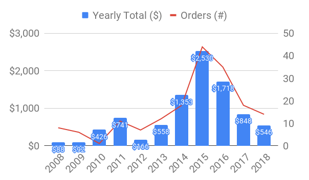
A few things about me that are relevant: First, I’ve recently come to believe that the single most important skill for an individual living today (especially in the U.S.) is personal finance. The basic premise of this is to spend less than you make (only possible using a budget or jedi mind tricks) and to… Continue reading A Decade of Online Spending
Tag: data
Data and Information Visualization Part II
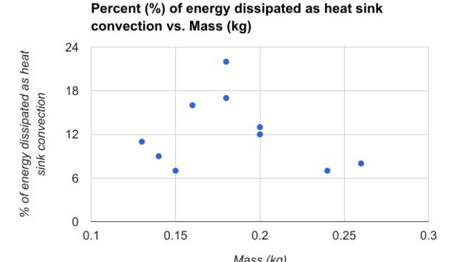
Sometimes it is important to create your own figures when they don’t exist. (see Data and Information Visualization Part I) The example I’d like to give is from a paper titled “Thermal Performance of Domestic Replacement A19 LED Lighting Products.” The paper highlights the varied nature of LED heat sink “performance” for a given set… Continue reading Data and Information Visualization Part II