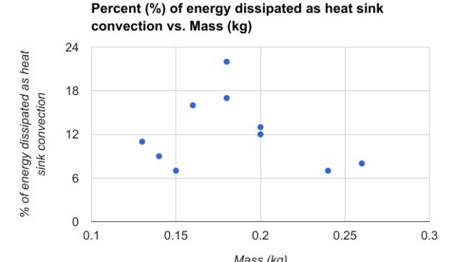
Sometimes it is important to create your own figures when they don’t exist. (see Data and Information Visualization Part I) The example I’d like to give is from a paper titled “Thermal Performance of Domestic Replacement A19 LED Lighting Products.” The paper highlights the varied nature of LED heat sink “performance” for a given set… Continue reading Data and Information Visualization Part II
Tag: graphs
Data and Information Visualization
If a picture is worth a thousand words then a graph or chart is worth at least a thousand words. The ability to understand and create graphs or figures is essential for anyone interested in Science Technology Engineering or Mathematics. Here’s a great example of how one might “boil down” a figure for their own… Continue reading Data and Information Visualization