If a picture is worth a thousand words then a graph or chart is worth at least a thousand words.
The ability to understand and create graphs or figures is essential for anyone interested in Science Technology Engineering or Mathematics.
Here’s a great example of how one might “boil down” a figure for their own use.

Let’s say we wanted to know how much power you, or anyone, could generate on a stationary bike.
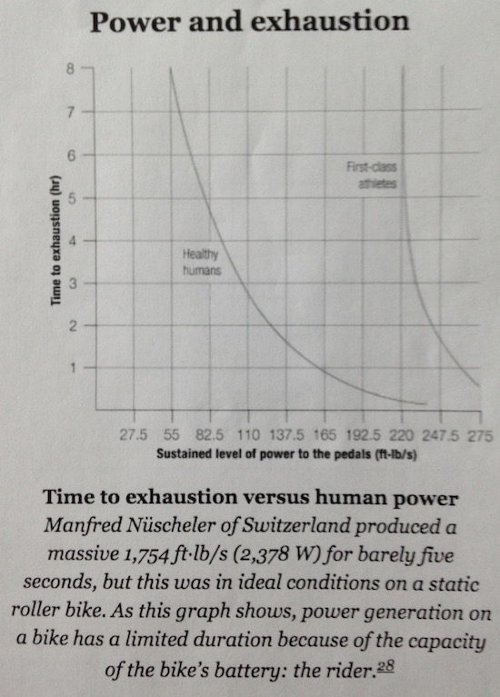
As always, we start by reading and doing research. It ends up there’s a lot of ways to measure this, but here’s a single graph that shows what we want to know (Figure 1).
Next, we read and study the figure to know exactly what it’s telling us. Understanding what data means and how to use it, is just as important as understanding exactly how the data was collected, and what assumptions are/were being made.
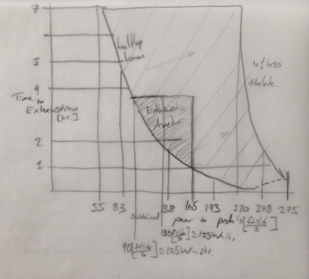
Next, once we understand exactly how the data was obtained, the assumptions and environment they were collected in, what the data means, and exactly how it applies to us, we get out tracing paper and “boil the graph down” to just what we need (Figure 2). Be sure to note the source where the graph came from (Traced from [1]).

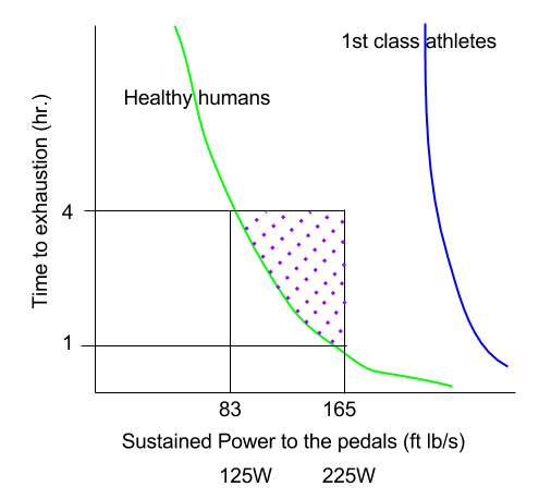
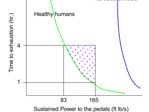
Finally, we may be interested in using this information later or displaying it to a particular audience. We can upload the tracing (or the original graph), and make a beautiful chart displaying the information as it pertains to you (Figure 3).

We can now easily see that an athletic person can generate between 100 and 200 Watts for between 1 and 4 hours. This means, an athlete could generate about 200 Watt-hrs. pedaling hard for about an hour.
This amount of energy could power a 100W television for two hours. (A small TV is about 70W. You can get this information from the back of your TV. For example, 0.6 Amps * 120V = 72 Watts)
(see Data and Information Visualization Part II)
References:
1. “Cycle Science” by Max Glaskin
You may also like:
