Sometimes it is important to create your own figures when they don’t exist.
(see Data and Information Visualization Part I)
The example I’d like to give is from a paper titled “Thermal Performance of Domestic Replacement A19 LED Lighting Products.”
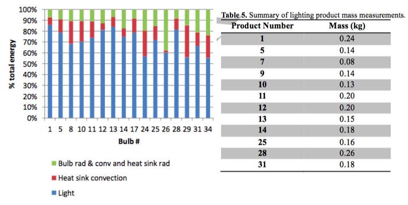
The paper highlights the varied nature of LED heat sink “performance” for a given set of bulbs and contains two interesting tables.
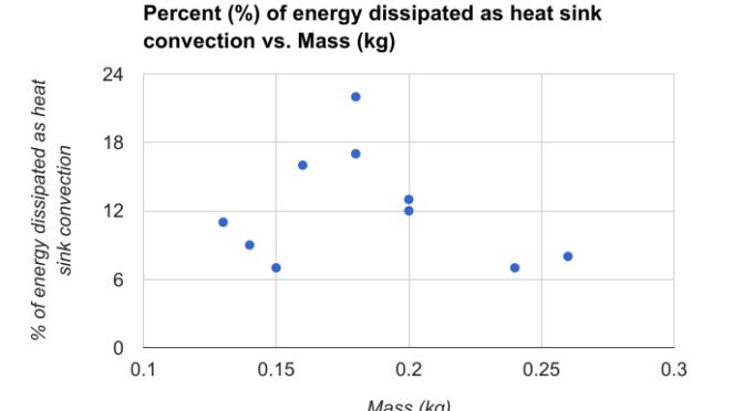
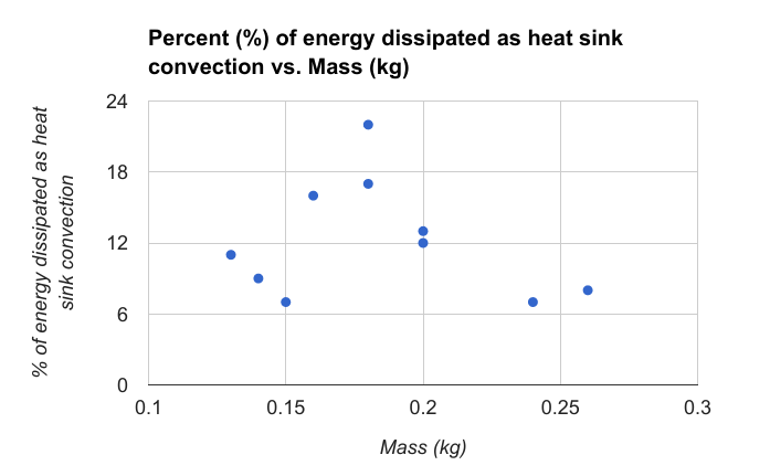
However, we may ask questions like: “Does product weight correlate with heat sink performance?”
We can pull data from the tables and graphs and make our own tables (I use google sheets, you can use Excel etc.).
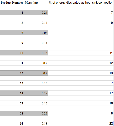
Finally, we make our own graph showing product heat sink performance (% of energy dissipated as heat) against product mass (kg) (Figure 3).
Finally, we are proud that we gained a new insight from our investigation, organization, creativity, and presentation.
It is always important to understand your data and what your figures, charts, tables, and graphs mean. In this setting, the research is focused on “heat sink performance” which does not mean the same as “bulb performance” or “system performance”.
This exercise is a great way to visualize data, information, or ideas.
You can read between the lines, have your own ideas, and even make your own figures!
Now, get out there and start reading, discovering and making!
**Update: The figure to the left shows a common mistake. Ordering is everything. The columns should be ordered by what we’re trying to illustrate. For example, if we’re trying to show the most “efficient” bulbs, we might order the columns by Light (Highest to least). Instead, the data is arbitrarily ordered by Bulb #, which is not relevant (and worse, random).
Happy plotting!
You may also like: